Sunday, December 6, 2009

GREETING CARD...


For my greeting card i decided to make a valentine's day card. i started off with these pictures below


i chose the flowers because flowers are the best way to show someone that you love them and since my car is a valentine's card,i thought it was the perfect match.
i opened a new page in adobe Photoshop and made it international paper A4 and then i used the ruler to mark the middle of the A4 paper landscape style. I was creating the inside of the card, so i used the gradient tool at 90% opacity and normal mode to design the inside of the card. as seen below


Then i chose the brush tool at normal mode and  92 % opacity using the 74 point brush to design the areas on the edges of the card


Next i copied and pasted the flower picture which i had,and then played with the layer style to change up a few things. I changed the inner glow and drop shadow of the picture.


Then i wrote the words on the inside of the card using the type tool. I wrote the following words 
"Love is blind
Love is beauty
Love is raunchy
Love is passion
My love for you is undescribable"


and then at the bottom of the card,the part which has the picture i wrote,
"Your love is like a flower
No matter what happens
I know it will always grow"


i styled the words as overspray using harrington font at 36 point


Next i opened a second page, same settings, international paper, A4, and used the ruller again to mark the middle of the paper,and then i started working on the front cover of the card. I used the same gradient overlay from earlier and then
I opened the other flower picture and then cropped out the smaller parts on the outside of the picture that i didnt want, then copied and pasted the picture. Then i scaled it to the right size which i wanted


Then i used different styles to blend it in, i applied drop shadow and also bevel and emboss to the picture. Then i played with the different filters like artistic, neon glow,brush strokes and dry brush to edit the picture.


Next i typed the words "GAPPY VALENTINE'S DAY"  on the front of the cover. then like before i used different styles and fonts to find the perfect one that i wanted to see which one blends more beautifully with the rest of the card.
My final product is below


Then when i was done i went to print my card... :-)
And this is the printed version of my card..


Sunday, November 22, 2009

GREETING CARD

I am planning on doing a valentine's day greeting card. I'm planing to take a picture of a nice scenery, or a beautiful picture of a flower with might represent love, or if im lucky ill be able to catch the sunset, or create a picture of cupid.. Right now i have not yet took the picture, because i have not found the exact spot i want, but as soon as i find that perfect spot i will edit it to the best of my ability to make it look good. Then when i'm done editing the picture ill write a poem in the card..i already wrote a very lovely poem which i feel will be perfect with what i am envisioning right now..

filters


Today i was playing around with filters..its all very fascinating..i explored everyone of them, it gives you a different shades and textures..below is an illustration


Monday, November 16, 2009

other pictures

below are other pictures i also made just to see how they would work out..


i used all the pictures to see which one would seem like the best wall paper and chose to use the last picture as it showd the FOM building much more than all the other pictures. i had another picture which i wanted to use with the FOM one,

i chose this picture because it has soo much coulor and i wanted my wall paper to be like that. The first step i took was i copied and pasted the FOM picture onto this picture on top. I put in effects to blend in the two pictures together, i played with different effects like satin,hue,saturation, bevel and emboss untill i came up with the perfect colour blending which i wanted.
I used the smudge tool to blend in the parts of the picture which i felt needed a bit more smoothening, then after which i tytped the letters MULTIMEDIA UNIVERSITY ,i used the CALLIBRI font at a size of 72 and bold to make it pop out and i also put in a few effects on the letters as well, i added a drop shadow to the letters and also tried out different other effects like bevel and emboss,satin untill i found just the right combination i wanted,i also made a gradient overlay to give the letters their multi coloured diversity.
The i typed the words FOM OPEN DAY with the callibri font at 60 points and also did the same kind off  effects as of the other letters(multimedia university) and i also added strokes to the words.
i used the rubber to rub off any parts which where overlaying or not very good.
Below is the final wall paper..
 

ASSIGNMENT ONE


The task was to make an ewall paper of  FOM OPEN DAY. I started by taking different photos of FOM from different levels.
below are the 4 photos i took


Sunday, November 8, 2009

OLD TO NEW

Today im retouching an old photo to make it appear new..here is the original picture below

I started by croping the photo to remove the outer part,the design on the picture,and then i used the spot healing tool to clear out some parts in the picture and to fix them. After which i used the healing tool brush to fix the rest of the picture. Then i used the blur tool to make the background of the picture smoother, after that i used the smudge tool to smooth off the other parts of the picture. Next i used the hue and saturation effect to change the colour of the picture after that i then chose the colour balance to adjust the colours to make it look better. Finally i chose the levels effect.
And below is the final result of my editing.


below is also some practice pics. 


before editing


after editing


retouching a photo


this week has been rather interesting and very progressive for my learning...i have been practicing the various ways of retouching a picture and making it look better..i took the picture from my last post and edited it a bit to make it look more appealing and make it look even more gorgeous. i was masking the picture and using tools like crop tool,mask feature and blurring to name a few...and i want to share my pictures..

Friday, November 6, 2009

Exercise 2

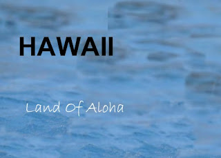
This exercise was a tad bit challenging for me as it is my first time editing a picture,needless to say iv never used photoshop before..i started out by typing the words (Land of Aloha and HOWAII) first,on a new page, then after that i used the picture below to remove the swimmer so as to be left only with the water background.

after which i moved the water background to my other pallet and placed it there so as to use it as the background for the letters i typed there earlier and the resulting image is the one below
 

Wednesday, November 4, 2009

The first excercise

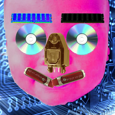
Photoshop is a truly amazing software that helps us edit photos and make them more than they already are.. For my first assignment i was making a face using computer components..i did not necessarily chose components which resemble human face parts, i just chose ones which i thought looked more creative and out there.
i chose the CD for the eyes

 The RAM for the eye brows

the red flash drive as the lips

The end of the cord as the nose

And the result of the whole combination is below

I decided to change the colour and also edit the pic a bit so as to make it look a bit intricate.